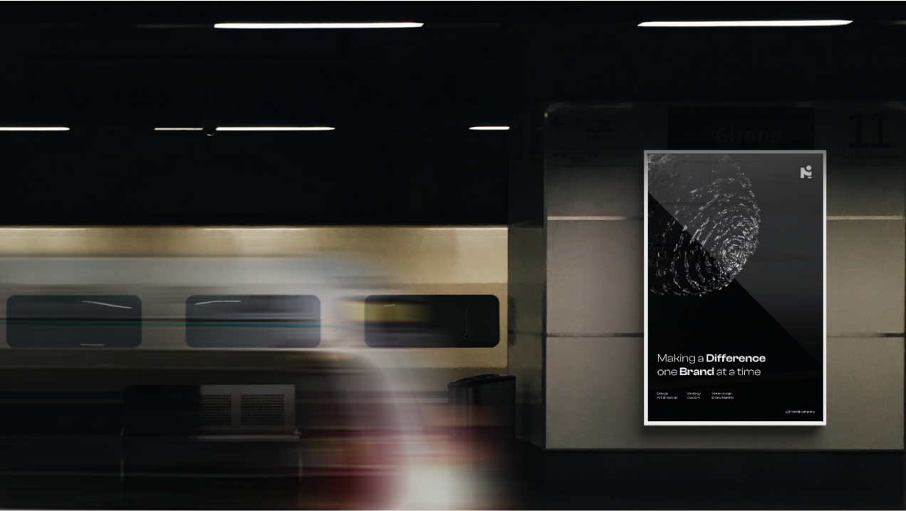
The NOTI Company
03
07
2022

The Brief
The project encompassed a comprehensive overhaul of NOTI's visual identity and online presence. The primary objectives were to modernize our visual identity, establish a strong online presence, and create a cohesive design language that would resonate with our target audience - innovative businesses seeking creative branding solutions. It was crucial to convey NOTI's creative ethos while showcasing professionalism and versatility.
typeface
Josefin Sans
Josefin Sans, with its clean lines and geometric shapes, captured the essence of NOTI's commitment to innovation and modern design. The typeface's versatility allowed it to seamlessly integrate across various applications while maintaining a consistent and sophisticated appearance.
Designed by Google
- light
- regular
- medium
- semibold
- bold
- extrabold
primary
hex
#OOOOOO
secondary
hex
#F1F1F1
hex
#FFFFFF
hex
#0C3EF9
hex
#050505
enchantment
freesia
shadow
palette
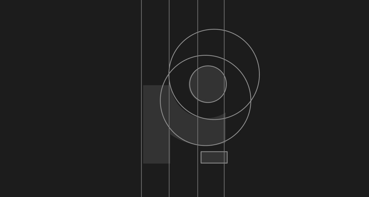

Applications
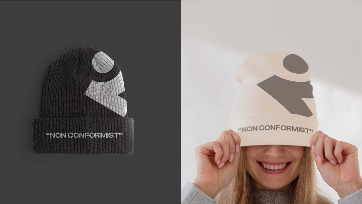
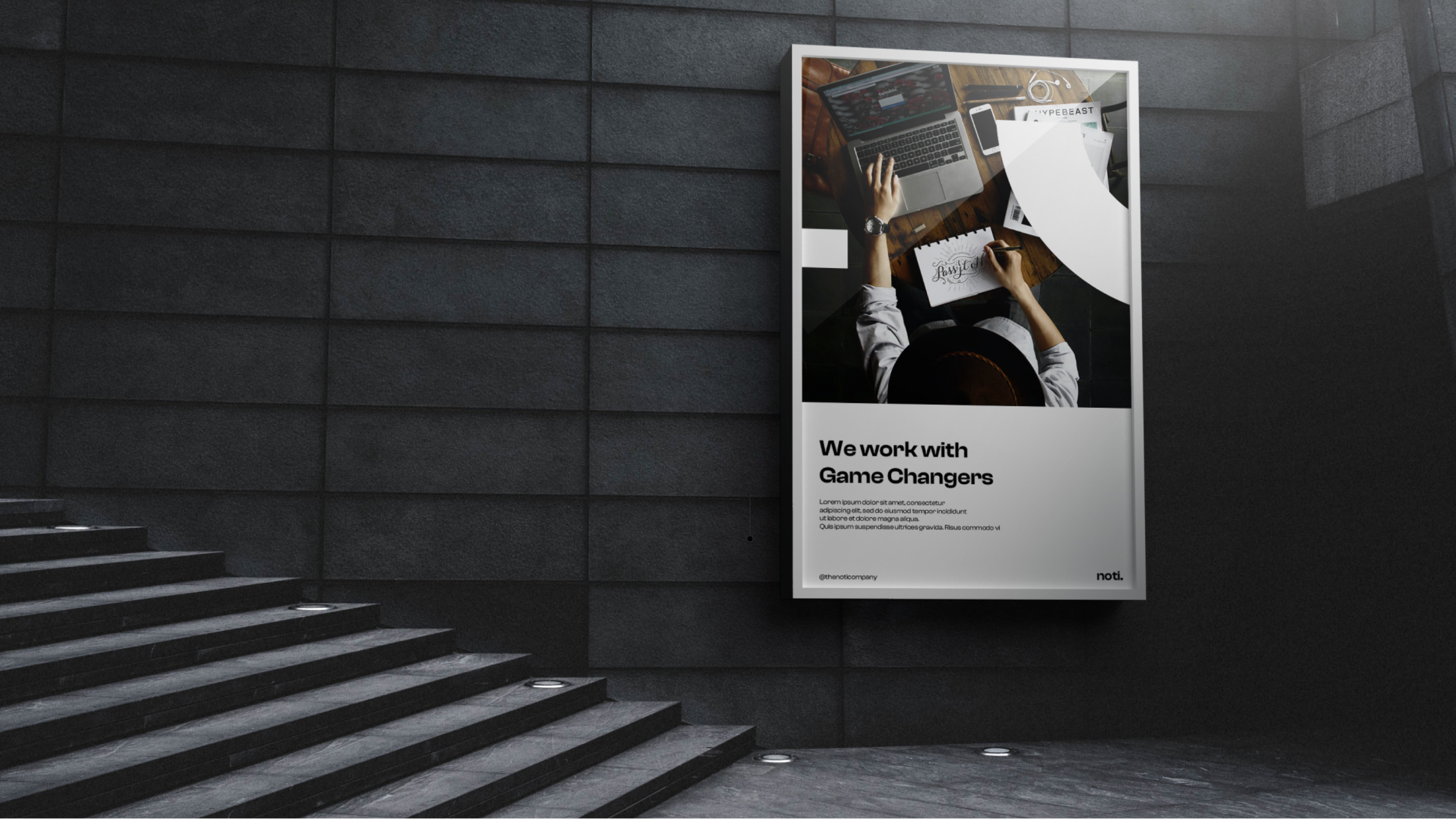
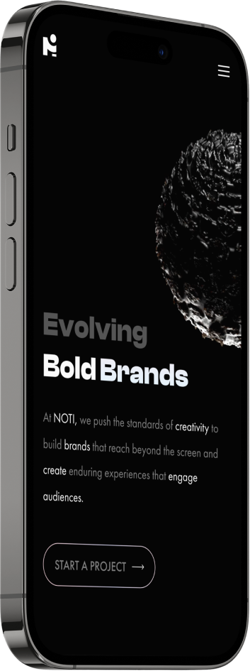
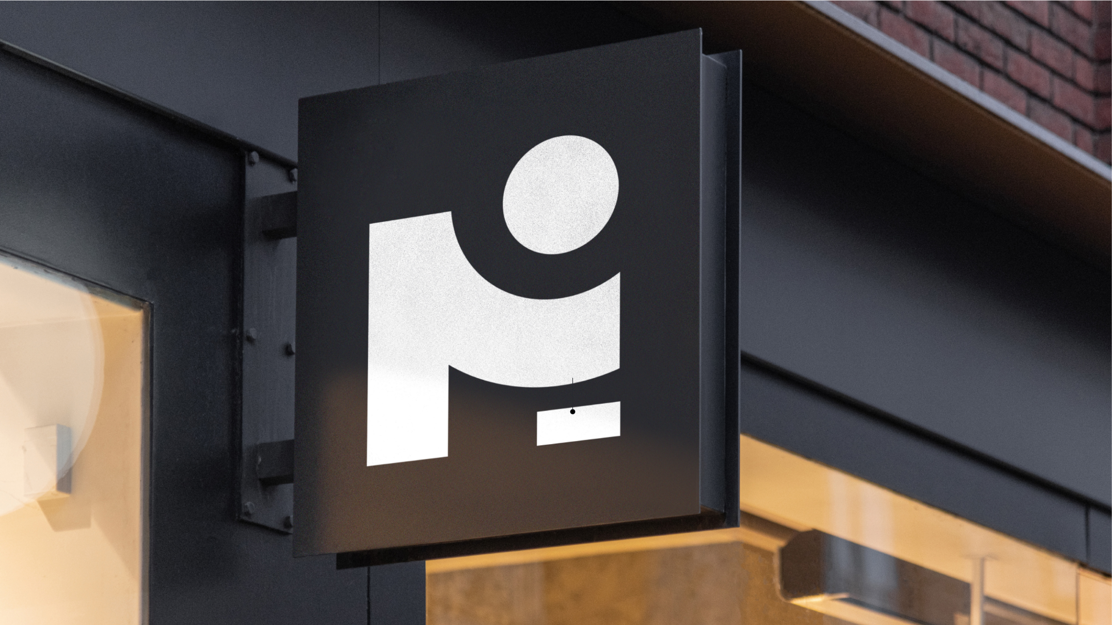
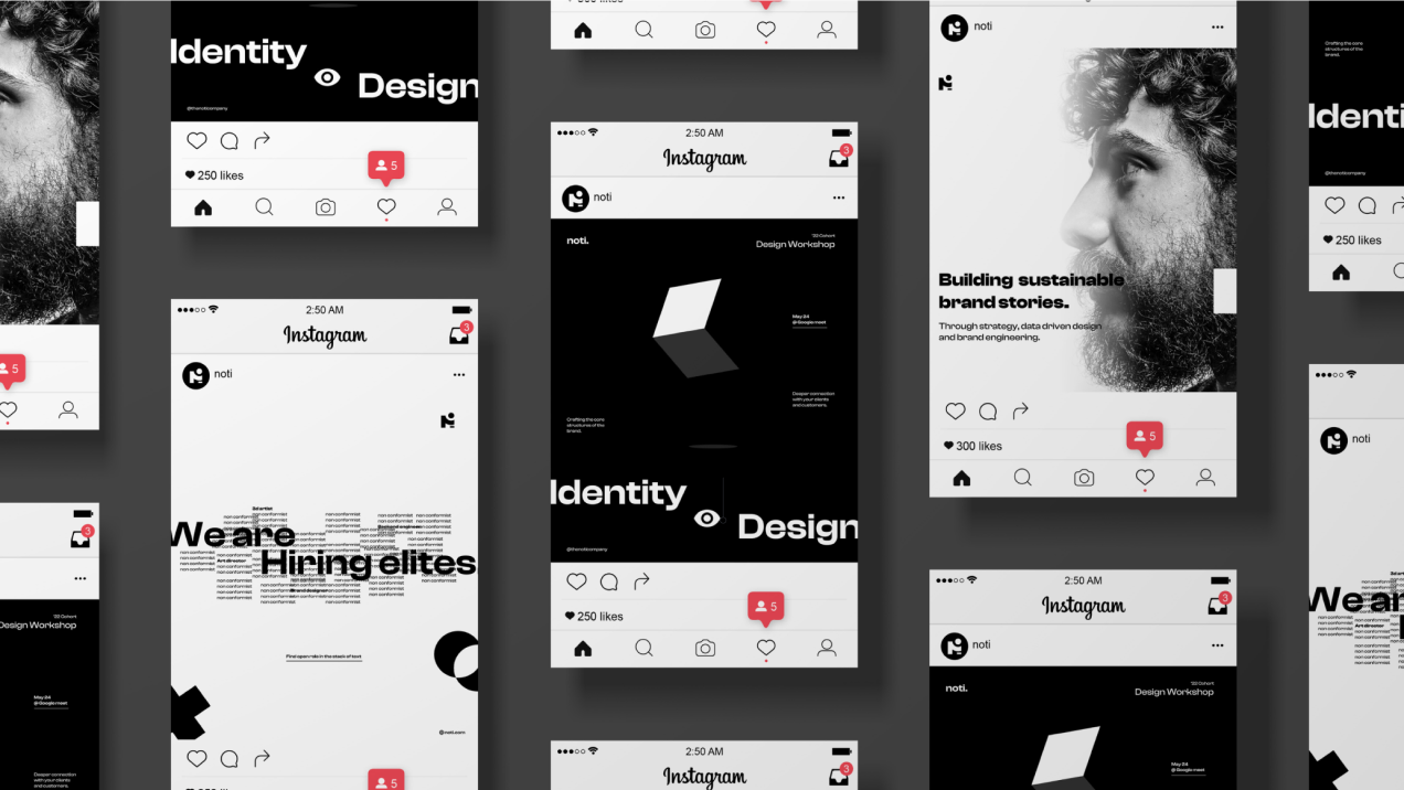
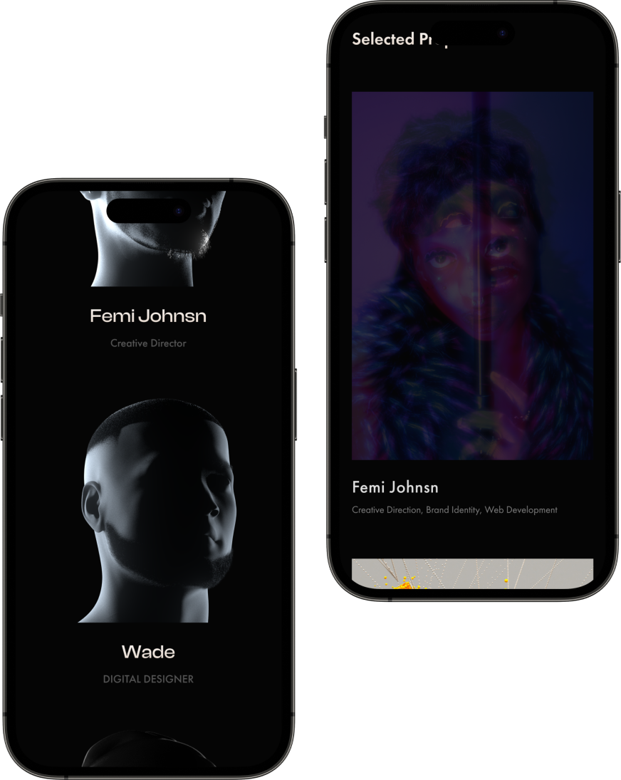
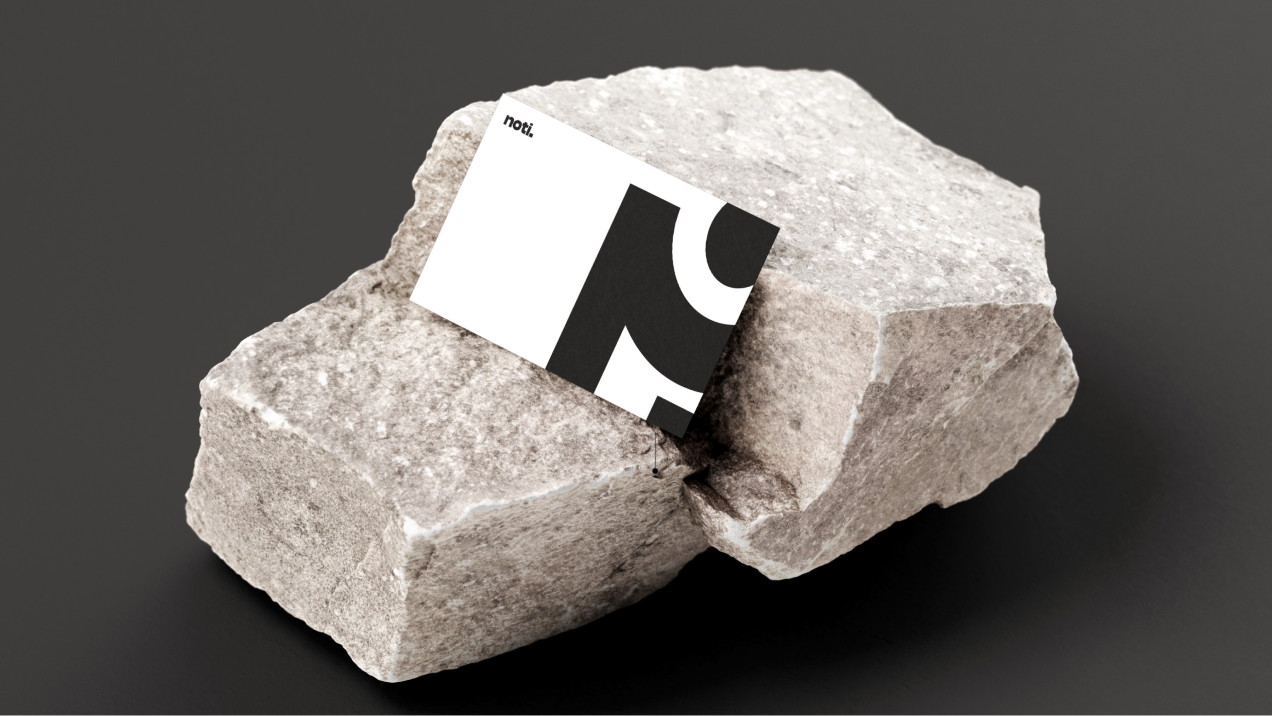
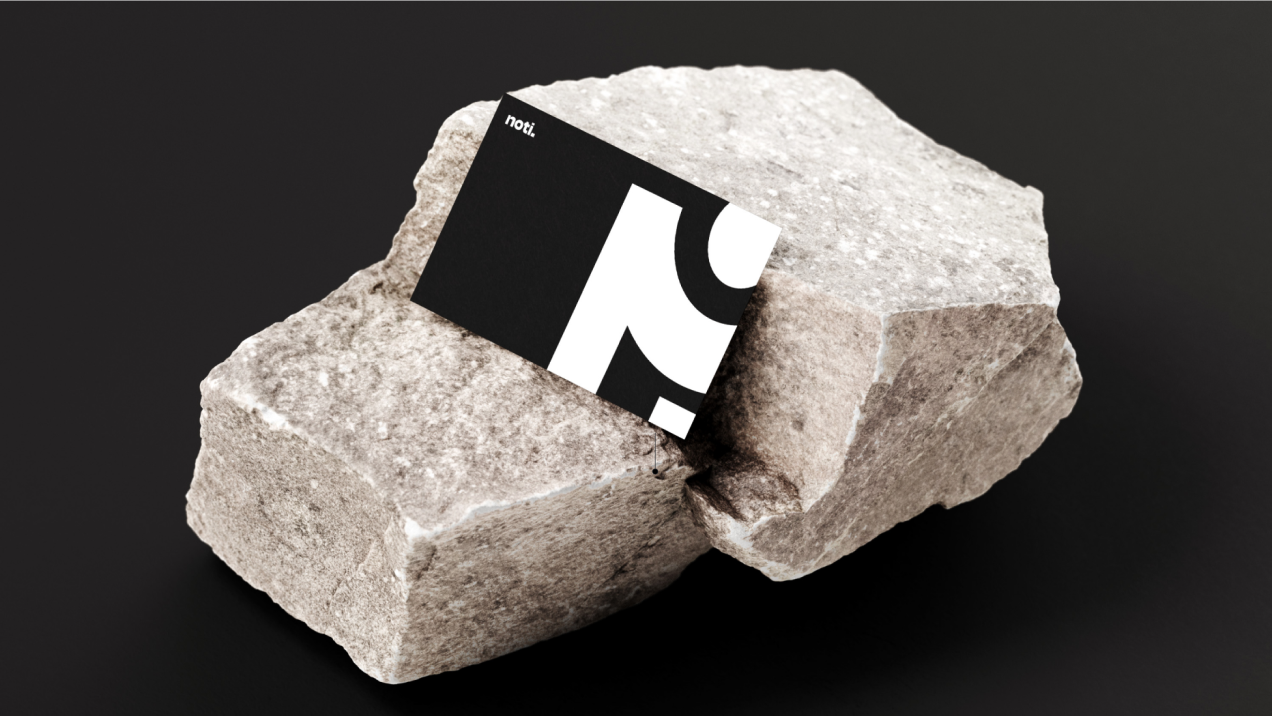
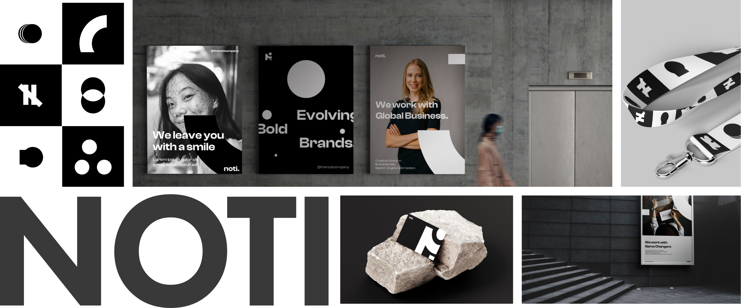
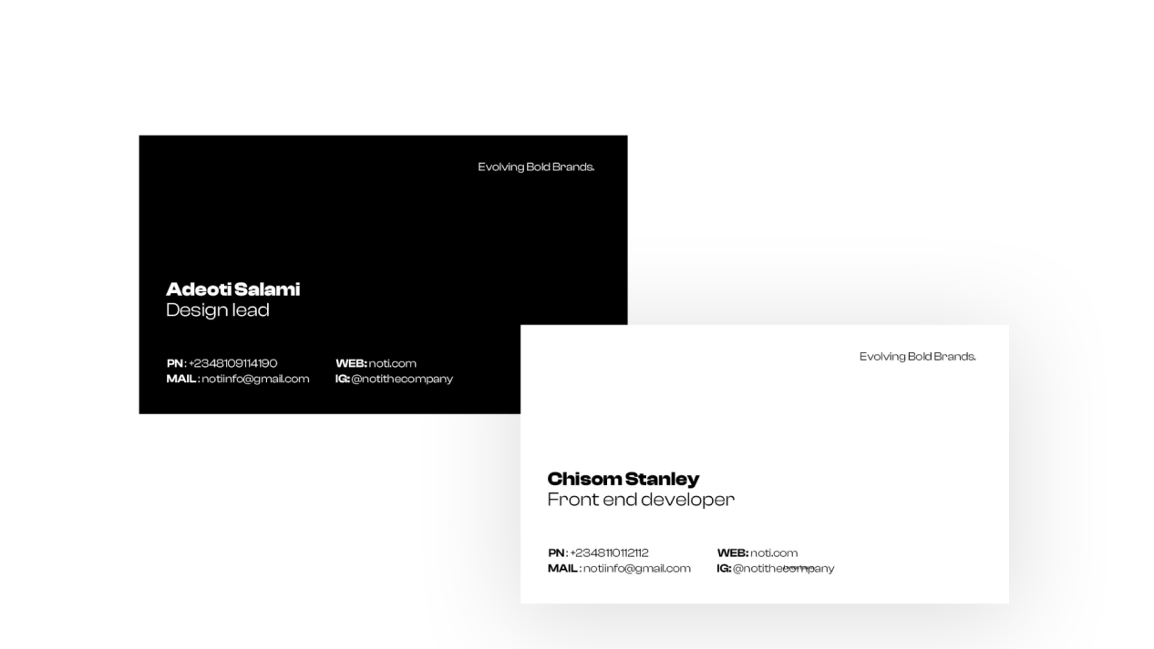
The new branding assets found their application across a wide spectrum of touchpoints. From the elegantly designed business cards that left a lasting impression during networking events, to the engaging website that showcased NOTI's portfolio and services, the branding assets consistently communicated NOTI's values. The design system we created ensured that every visual element adhered to the brand guidelines, fostering a sense of continuity across both digital and physical platforms.
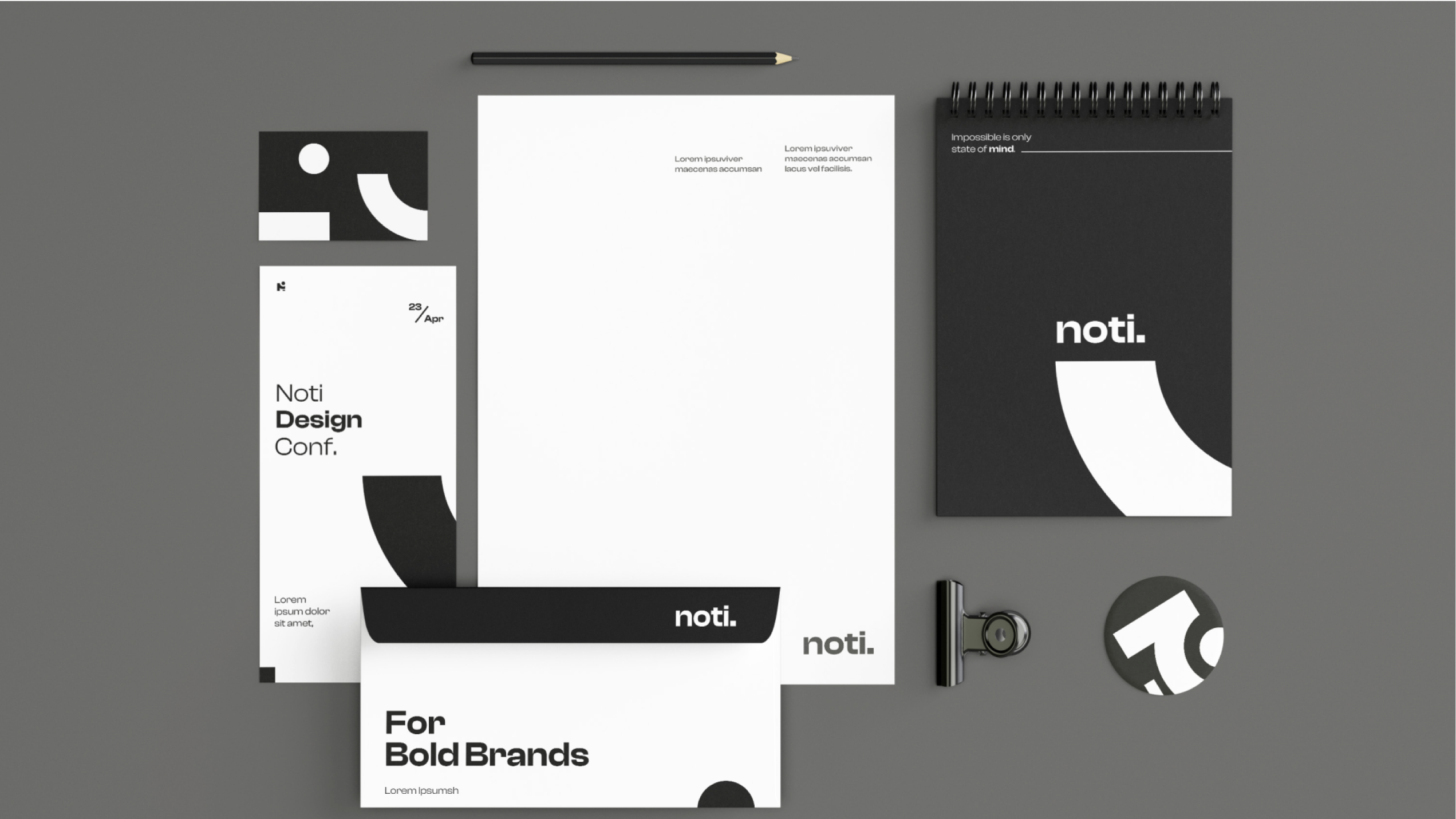
NOTI's new visual identity successfullypositioned us as a forward-thinking,dynamic, and professional design studio,poised for continued growth andsuccess in the competitive creativeindustry.
